The Trust-Building Secret I Discovered When Users Ignored Our Onboarding Tour
- Sophie Pilley
- Jul 10, 2025
- 6 min read
Forget perfect onboarding—discover the invisible design patterns that actually build user trust, backed by my research at scale-ups and insights from top-performing SaaS products.

📚 Reading time: 9 minutes
🔮 Hidden Patterns: Inside the invisible design patterns that top SaaS products use to build trust—insights from my work at Picsart and research across the industry.
💬 In this article:
The Day Users Ignored Our Welcome Tour
😱 spoiler: they still became power users
I want to share something that completely changed how I think about user trust. A few years back, I was working on a product team where we'd spent weeks crafting this beautiful, comprehensive onboarding tour. We were so proud of it – tooltips, guided flows, the works.
Then came user testing day. I watched as user after user completely ignored our carefully crafted guidance. They clicked "skip" without a second thought, and my heart sank. All that work, dismissed with a hasty click.
But here's the weird part – some of those same users who skipped the onboarding? They later became our most engaged power users.
This contradiction haunted me.
If our standard onboarding wasn't responsible for their success, what hidden forces were at work? What subtle signals had we inadvertently woven into the product that built enough trust for users to stick around and flourish?
This started me on a quest to discover something I now call "hidden trust signals" – the subtle, often invisible elements that actually build user confidence and loyalty. And what I found was pretty mind-blowing.
At MyWorld, we actually increased user retention by 53% by delaying access to certain tools. Yes, you heard that right – by adding strategic friction, not removing it.
Today, I'll reveal four hidden trust signals I've uncovered through countless user interviews and A/B tests—patterns that separate fleeting engagement from genuine user loyalty.
When 'Best Practices' Backfire
The Hidden Trust Equation
We've been trained to follow certain onboarding "best practices": reduce friction at all costs, get users to their "aha!" moment ASAP, and showcase all your fancy features immediately.
But research consistently showed these "best practices" often don't test well. Users feel overwhelmed or disconnected from products, even when they dutifully complete onboarding checklists.
As one participant in a study we did confessed: "I completed the tutorial, but I still didn't really know what to do next."
This reveals a fundamental truth: High completion rates don't always translate to genuine engagement, and "fast" onboarding can actually decrease trust if it sacrifices clarity and meaningful interaction.
While unnecessary friction is obviously detrimental, the right kind of friction, strategically placed, can be a powerful trust builder.
This happened at Picsart with our "guided edit" flows. This structured experience wasn't about hand-holding in a patronising way. It was about providing just enough scaffolding for users to feel successful, without overwhelming their senses.
This "hand-holding," which added a few extra steps, created a sense of investment and accomplishment – a crucial first step in building a trusting relationship.
The 4 Hidden Trust Signals I Discovered
🪄 Signal 1: Guiding Without Overwhelming
Traditional onboarding often bombards users with tooltips and walkthroughs. But our research revealed something fascinating: users trust products that make them feel competent, not overwhelmed.
At Picsart, we discovered that users clicked on our prominent "Getting Started" card less than 20% of the time. However, when we replaced it with contextual guidance at moments of potential confusion, engagement skyrocketed.
🧙The magic ingredients:
Empty States That Guide
Instead of a blank canvas, Miro presents new users with templated options and clear starting points. This eliminates the intimidating "blank page syndrome" while subtly guiding users toward successful first experiences.

Progressive Disclosure
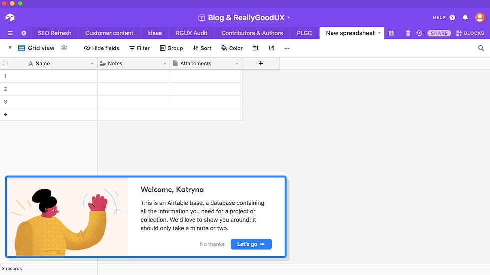
Airtable expertly avoids overwhelming new users by progressively disclosing features. Instead of presenting the full power of their database upfront, they start with a familiar spreadsheet-like interface. As users become comfortable, Airtable subtly introduces more advanced capabilities, allowing users to gradually expand their knowledge without feeling lost.
✨ Signal 2: Building Confidence Through Mastery
We knew users craved powerful editing tools, but simply showing them everything at once led to overwhelm and abandonment. How could we create a sense of discovery and mastery, rather than intimidation?
At Picsart, we pre-completed one item on new users' checklists (account creation) to create an immediate sense of progress.

💡The surprising pattern I found across successful products:
Guided Achievements
Linear's approach to project management exemplifies this. New users are guided through creating a simple task, assigning it to a team member, and setting a due date. Only after mastering these basics are they introduced to more complex features. This gradual unfolding of functionality prevents overwhelm and builds confidence.
Progressive Complexity
Midjourney provides a perfect example in the AI art world. New users start with simple text prompts like "/imagine a cat wearing a hat". As they experiment, they're gradually introduced to more advanced parameters: aspect ratios, styles, chaos levels, and even the ability to blend images. This staggered approach allows users to feel a sense of continuous learning and discovery.
The common thread? These aren't just about delaying features; they're about carefully crafting a learning journey that builds user confidence and competence.
💫 Signal 3: Earning Trust Upfront
The most trustworthy products don't just promise value; they deliver it immediately. This "give before you ask" approach creates a powerful reciprocity loop, building trust from the very first interaction.
At Picsart, we created an interactive "guided edit" that allowed users to experience our key features in a structured way before asking them to create something independently. This wasn't just a tutorial; it was a chance to feel the magic of the tool before committing to a full editing workflow. Our studies showed that users described this experience as "empowering" and "surprisingly easy."

✨ This principle manifests powerfully as:
Immediate Value Delivery
Linear's interactive demo perfectly embodies this. Potential users can explore a fully functional, pre-populated project workspace before even signing up. It's not a passive video; they can interact with tasks, change statuses, and explore views, experiencing the product's power firsthand.
Strategic Free Features
Loom offers free video recording with their branding, allowing users to experience the core value – quick, easy video messaging – without any initial financial commitment. This not only demonstrates the product's functionality but also creates a viral loop as users share their videos.
🌟 Signal 4: Weaving Moments of Unexpected Delight
Strategic charm isn't about sprinkling random confetti effects throughout your product. It's about orchestrating meaningful moments of delight that reinforce trust and deepen user connection at precisely the right moments.
I've noticed this pattern across many successful apps:
Personalised Discovery
Spotify's annual "Wrapped" feature is a masterclass in personalized delight. It's not just a fun summary of listening habits; it's a demonstration that Spotify understands the user, creating a sense of connection and loyalty. By showcasing unique listening patterns and highlighting personal "top artists" and "top songs," Wrapped reinforces the feeling that Spotify is their platform, tailored to their individual tastes.
Effort Recognition
Asana's whimsical celebrations, like a unicorn or yeti flying across the screen after a completed task, acknowledge user effort in a delightful way. This isn't just random animation; it's strategically placed at a moment of accomplishment, providing a small dose of positive reinforcement.
Unexpected Helpfulness
Duolingo does this exceptionally well. When you make a mistake, you get a supportive notification from Duo the owl that encourages you to keep going. These don't feel annoying and help you see the app as more of a companion than "just" an app.
🪄 Casting These Spells In Your Product
A Practical Guide
Here's a quick checklist to audit and action these patterns in your own product:
✅ Signal Audit
Transparency & Guidance: Are steps clear and easy to understand, or might users feel confused?
Slow Reveal: Are you introducing features at the right pace, or overwhelming users too soon?
Gift of Value: What immediate value can you provide before asking anything in return?
Strategic Charm: Where could you add touches of delight to reassure or connect with users?
❌ Anti-Patterns to Avoid:
The "Feature Dump": Don't overwhelm users with every feature on day one
The "Forced March": Don't make users complete a lengthy, linear onboarding process
The "Random Sparkle": Ensure every delightful moment serves a purpose
Quick-Win: Take one key screen in your product with a blank or unhelpful empty state and redesign it to provide clear guidance and encourage action.
The Magic of Invisible Trust
Just like we discovered at Picsart, the most powerful trust signals are often the ones users don't consciously notice. They're woven into the fabric of the experience, creating a sense of ease, confidence, and connection without drawing attention to themselves. Like any great magic trick, the real work happens behind the scenes.
By shifting our focus from obvious onboarding to these hidden trust signals, we can create products that not only function well but also feel genuinely trustworthy and delightful.
So, take a closer look at your own product. Where are the hidden opportunities to build trust? What subtle changes can you make to create a more magical experience?
I encourage you to share your findings and experiments – let's uncover the secrets of "invisible trust" together.
Until our next adventure,


Comments