The Magic Formula: How 'Just the Right Effort' Supercharges User Retention
- Sophie Pilley
- Jul 10, 2025
- 5 min read
Why great products make you earn their love – and why effort is the hidden ingredient to real user obsession

🧠 Psychology of Delight: The hidden psychology of effort that creates unbreakable product loyalty
Welcome back, adventurers! 🗺️ 🧭
I used to believe what everyone in product design preaches: make it frictionless! Remove steps! Simplify everything!
Then I noticed something surprising.
The products I couldn't live without weren't the easiest ones. They were the ones that made me work a little.
The quest begins... ✨
I've spent years obsessing over why some SaaS products create fanatic loyalty while others with similar features are forgotten in weeks. After countless product teardowns and my own painful lessons, I've discovered something that flies in the face of conventional wisdom:
The "magic formula" often includes a dash of deliberate friction.
In this article, I'm going to challenge that "frictionless is always better" and show you:
Why humans are wired to value what they work for (even when they complain about it)
The psychological principles that transform effort into emotional attachment
How to identify which types of friction build loyalty and which just frustrate users
The three key ingredients that turn initial struggle into long-term commitment
Join me as we explore the psychology behind products users can't quit – and set the stage for part two, where we'll dive into the practical application of these principles.
🪝Rethinking Friction – Why "Effort" Is the Real Hook
I remember sitting in a client meeting where everyone was nodding along to the mantra "reduce steps at all costs." I nodded too, but something felt off.
If friction is always bad, why do I still use Notion every single day when simpler note-taking apps exist?
The truth hit me while designing a user journey for a council service. We started by creating the shortest possible path to check bin collection days – just enter your postcode and boom, there's your answer.
But users were still calling the support line. Why? Because the frictionless journey was missing critical details. Sometimes bins weren't collected as scheduled or reported on time, and without asking a few more questions, we couldn't help users report the right problem.
💡 Adding "friction" – a few more targeted questions – actually reduced frustration. Users got the right solution faster, even though it took more steps.
Here’s where a mentality shift might help: instead of framing “friction” as a universal nuisance, what if we saw it as a tool for deeper engagement when used intentionally?
The Effort-Value Paradox
Nearly every product design trend is chasing ease and speed. But humans value what they fight for. Ease doesn't create attachment—hard-earned moments do.
When was the last time you felt truly proud of something that took zero effort? Probably never.
Our brains are wired to remember emotional peaks, not the smooth, flat lines of effortless experiences.
Effort triggers the brain's reward systems—creating dopamine during struggle and after achievement. Hard products literally feel better long-term.

The Friction Audit Your Product Needs
Look at your product's touch-points and ask two questions:
Where are users working too hard for too little reward?
Where are things so easy that users don't feel invested?
Take a moment to think about a product you admire. Does it make you wrestle a bit for its payoff? That might just be why you value it so much.
Let’s break this down further using three key psychological principles.
🧪 The Psychology of Earned Satisfaction

Ingredient 1: Transformation
Make Users Better Versions of Themselves
The most powerful products don't just help users complete tasks – they transform users into someone new and improved.
The key question: What is the aspirational version of your user? What role does your product play in that metamorphosis?
Example - Strava: Strava isn't just a fitness tracker; it transforms users into athletes. When one of my friends started using Strava, they weren't a 'runner' – they were someone who occasionally jogged. The effort of consistently recording workouts, analysing performance data, and competing with others on segments fosters a sense of athletic identity and accomplishment. Their "Best Efforts Challenges" track users' fastest times, encouraging continual improvement toward their aspirational athletic self.

Ingredient 2: Ownership
Make Users Feel "This Is Mine"
I used to hate Notion's block editor. Coming from simple apps like GoodNotes, the learning curve felt steep and unnecessary. What's with all these slash commands? Why do I need to understand "databases"?
Six months later, I was creating custom dashboards for every project and couldn't imagine working any other way. The initial friction became my superpower 🦸♀️.
Notion just gets this right. I've spent countless hours customising my workspace, creating intricate systems with their database functionality, and personalising pages with custom designs. Now I'm trapped – in the best way. The thought of switching to another tool and losing my carefully crafted system feels painful. I'm emotionally attached to what I've built.

Ingredient 3: Progressive Mastery
Level Up Users Skills
People love getting better at things, especially when they can see their progress. The best products create clear paths to mastery with increasing rewards along the way.
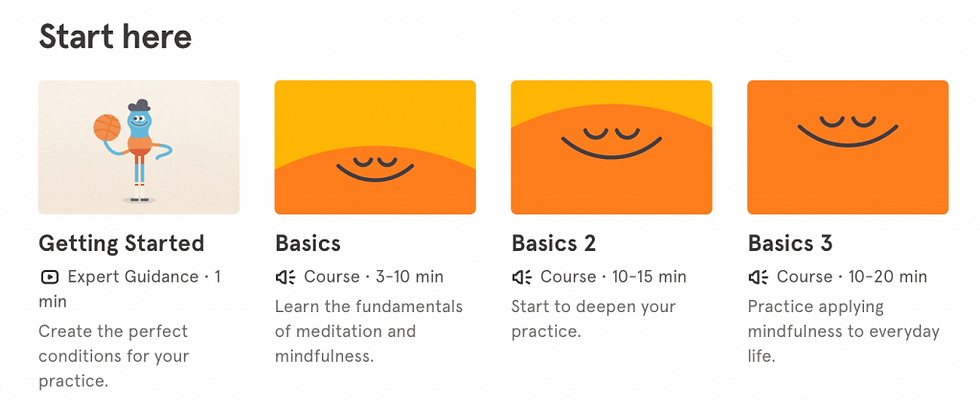
Example - Headspace: Their approach to meditation mastery is brilliant – beginners start with a gentle 5-minute session that introduces the basics. As you progress, you unlock new content (you can't skip ahead), gain access to longer sessions, and advance through increasingly sophisticated techniques. The clear progression from novice to experienced meditator creates a powerful sense of achievement that keeps users coming back

The Secret Ingredient: Meaningful Effort
I used to chase frictionless perfection in every product I designed. I'd eliminate steps, simplify interfaces, and remove any obstacle in the user's path.
But I was solving the wrong problem.
The products we can't live without aren't the easiest ones—they're the ones that ask for meaningful investment and deliver proportional rewards. They transform us, give us a sense of ownership, and provide a path to mastery.
As you design your product experience, ask yourself:
Where in your user’s journey are you offering the chance for deeper connection?
What meaningful challenge can you introduce today that creates delight later on?
Turn intentional effort into a source of deeper engagement —build products that don’t just solve problems but invite users into a shared experience they won’t want to leave.
Coming Up Next
Understanding these psychological principles is just the first step!
In part two of this series, I'll show you how these principles play out in real high-growth products through before-and-after transformations that prove how this approach works.
Until our next design adventure,


Comments